In this section you’ll find charts and graphs laying out the most important numbers in American philanthropy. They document how much we give, how that has changed over time, what areas we give to, and what mechanisms we use to donate. There are figures here on where charities get their money, how many people (and of what type) offer volunteer labor, the demographic factors that influence generosity (income, marriage, education, race, ideology), and how various states and cities differ. The top foundations and donor-advised funds are ranked by their giving. We present surprising information on overseas aid, and statistics on how the U.S. compares to other countries when it comes to donating to charity.
Real Rise in U.S. Giving
After adjusting for inflation, charitable giving by Americans was close to seven times as big in 2016 as it was 62 years earlier.
Of course, one reason total giving went up is because the U.S. population almost doubled. But if we recalculate inflation-adjusted charitable giving on a per capita basis, we see that has also soared: by 3½ times. Charitable causes are very lucky to have a remarkably expansive American economy behind them, and a standard of living that refuses to stagnate.

What if we calculate charitable giving as a proportion of all national production (GDP)? The math reveals that over the last 60 years, donations as a proportion of our total annual output increased—but only very slightly. For most of the last lifetime, giving has hovered right around 2 percent of our total national treasure.
Two percent of GDP is a huge sum, particularly in comparison to other countries (see details on that at Graph 27). But it’s interesting that even as we have become a much wealthier people in the post-WWII era, the fraction we give away hasn’t risen. There seems to be something stubborn about that 2 percent rate.
Percentage of U.S. Donations Going to
Various Causes
Religious causes are, and always have been, Americans’ favorite charitable targets. Of course, “Religion” is a very broad category. Some of those funds are used to support houses of worship and clergy, to maintain the faith, and to proselytize future generations. Much religious charity, however, ultimately goes into sub-causes like relief for the poor, medical care, education, or aid sent to low-income countries or victims of disaster.
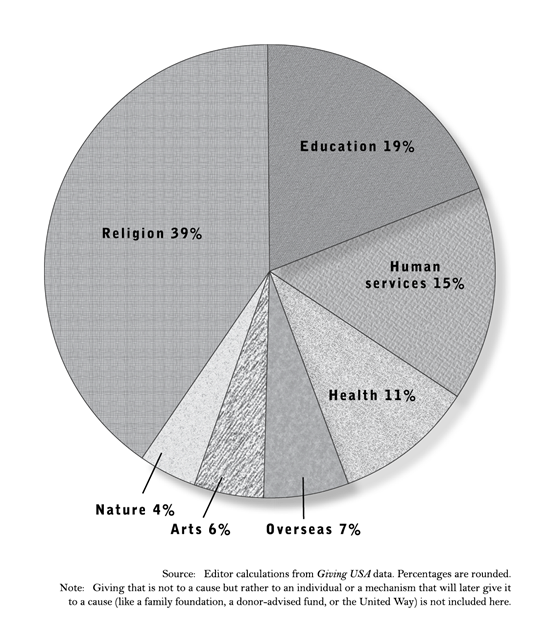
Keep in mind too that religious charities tend to have less access to supplemental funds than other nonprofits. Hospitals and colleges charge users fees to supplement their donated income; other nonprofits sell goods; many museums charge admission; some charities receive government grants. Churches and religious charities, however, operate mostly on their donated funds depicted in this graph.
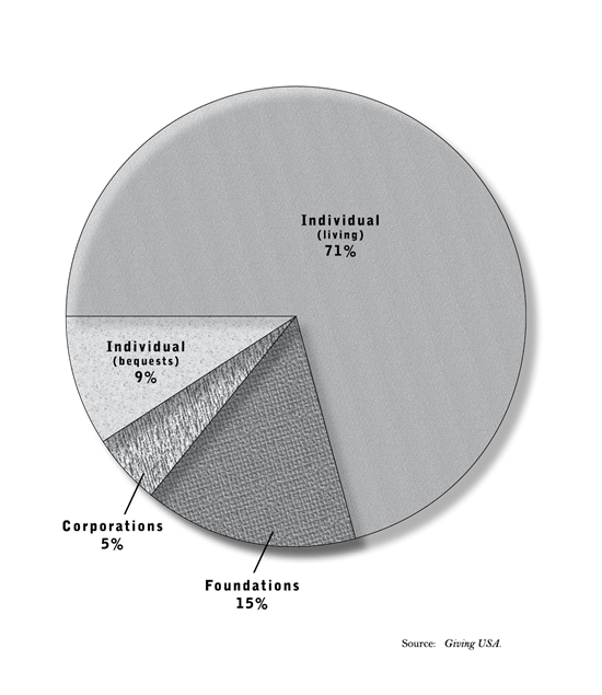
Sources of U.S. Charitable Giving
It’s easy, amid press stories about the projects of large foundations or corporations, to forget that the vast bulk of American philanthropy is carried out by individuals. Between individual donations and bequests in wills, personal gifts come to over four times as much, every year, as what behemoths like the Gates, Ford, Walton, etc. foundations plus corporations give away.
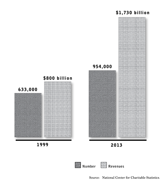
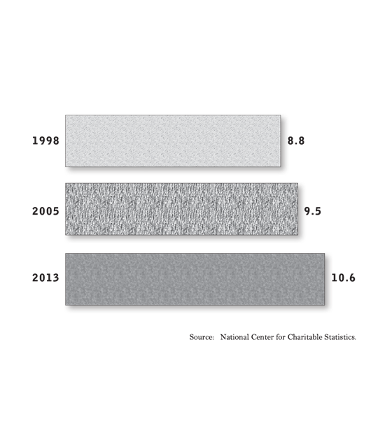
Growth of Public Charities
The number of nonprofits, and their revenues, have both grown quickly in recent years.
Percentage of U.S. Workforce Employed in Nonprofit Sector
Nonprofits have grown faster than government and faster than the business sector over the last generation, even during boom periods.
The figures charted here actually underestimate the fraction of American manpower that goes into charitable work—because they show only paid employment, while volunteers carry out a large share of the labor poured into these groups. Various calculations of the cash value of donated labor suggest that at least an additional 50 percent of output by charities takes place invisibly because it is produced by volunteers. You’ll find more statistics on American volunteering in Graphs 8 and 9.
Output of Nonprofit Sector
Charitable activity is becoming a bigger and bigger part of America’s total economy. For perspective, consider that annual U.S. defense spending totals 4.5 percent of GDP. The nonprofit sector surpassed the vaunted “military-industrial complex” in economic scope way back in 1993.

Our charitable world is actually even bigger than this graph indicates, because its output is underestimated in several ways. The official annual statistics ignore the fact that about a third of the charitable workforce is unpaid (volunteers), and therefore invisible to the tabulators of economic activity. Also, the unusual definition of the nonprofit sector that is employed by the U.S. Bureau of Economic Analysis results in many charities that are officially registered with the IRS getting their annual output counted as part of the business sector, rather than as charitable activity.
Nonetheless, even the partial measure graphed here makes clear that philanthropic work has become a big part of our national output.
Sources of Revenue of Public Charities
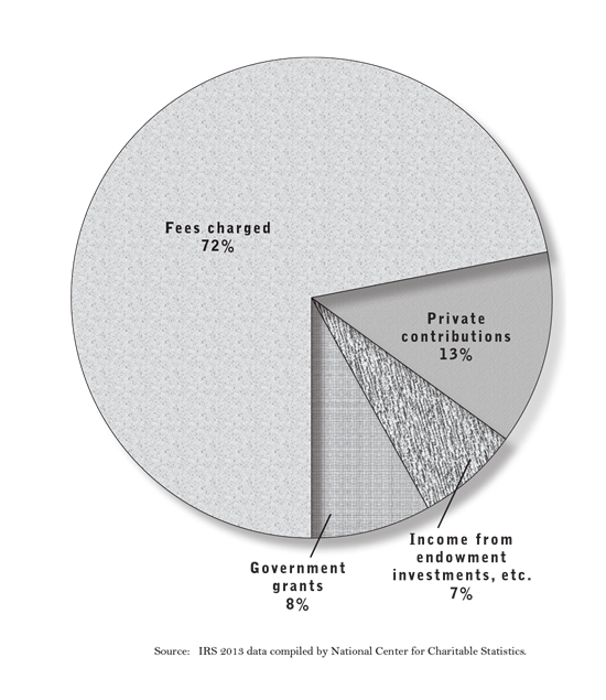
The underappreciated fact illustrated starkly here is that many charities sell things—from used clothes to admission tickets to college educations—and rely heavily on those market revenues to keep their doors open. You can see that government grants are not a large portion of the income of U.S. public charities as a whole—annual donations plus income from invested gifts are twice as big. Of course there are also substantial government fees paid to charities as reimbursements through programs like Medicare and Medicaid. Within the “Fees charged” slice of this pie, a little more than two thirds of the money collected was private, but close to a third came from some level of government that was paying for a charitable service rendered.
Volunteering in the U.S.
This data comes from detailed time logs that statisticians ask householders to keep. In less strict definitions like phone surveys, more like 45 percent of the U.S. population say they volunteered some time to a charitable cause within the last year.

Current estimates of the dollar value of volunteered time range from $179 billion per year to more than twice that, depending on how you count.
Volunteering is closely associated with donating cash as well. One Harris study showed that Americans who volunteered gave 11 times as much money to charity in a year as those who did not volunteer.
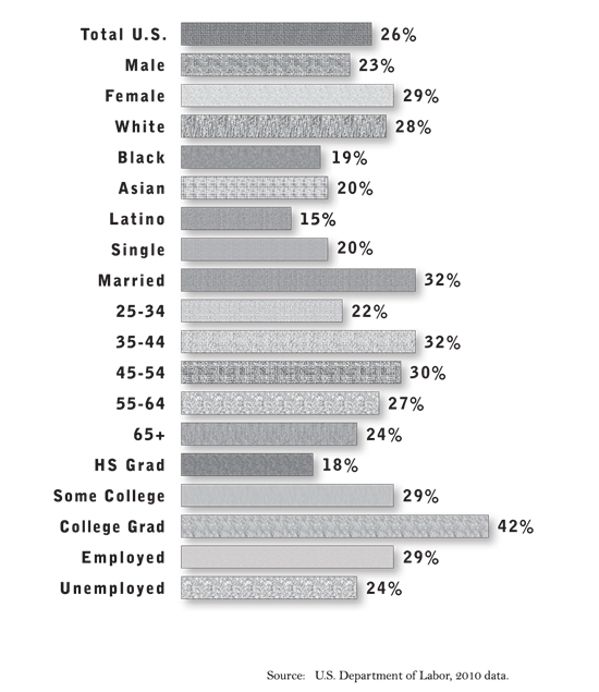
Demographics of Voluntarism
Volunteering takes place at very different levels among different segments of the population. Women volunteer more than men, whites more than blacks or Latinos, married persons much more than singles. Younger and older people lag well behind 35- to 55-year-olds. The more educated are vastly likelier to give of their time. And unemployed persons don’t use their extra hours to volunteer—they actually do less than those who are also holding down jobs.
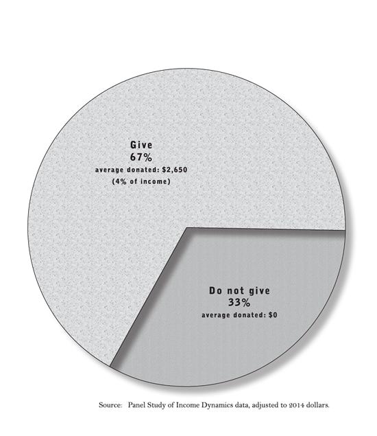
Proportion of Households that Donate to Charity in a Given Year
Charitability is not evenly distributed. The two thirds of households who give money actually average a hefty 4 percent of their income in gift-making. It is the other third of the population giving nothing who pull down the national average.
Percentage of Households Giving to Charity
by Annual Income
An interesting pattern emerges if one studies giving by income level. As incomes rise, more and more of the people in that bracket make gifts to charity. The sizes of their gifts tend to rise as well. However: if you look at average donations as a fraction of funds available, they tend to level off at around 2-3 percent of income.
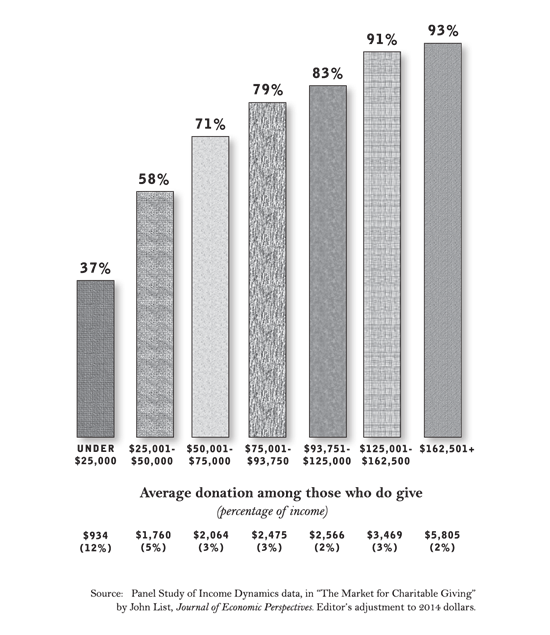
The exception to this pattern comes at the bottom of the income spectrum. Low-income households are the only ones in America where a majority do not give money to charity. Among the minority of poor who do give, however, a significant number are sacrificial donors—sharing double-digit portions of their incomes.
These sacrificial givers generally fall into two categories. Lots are religious, who tithe or otherwise give generously even when they have modest means. Others are elderly persons who have modest annual earnings yet are able to give because they have savings or paid-for homes and other assets that incline them to generosity.
Influence of Marriage and Education on Likelihood of Charitable Giving
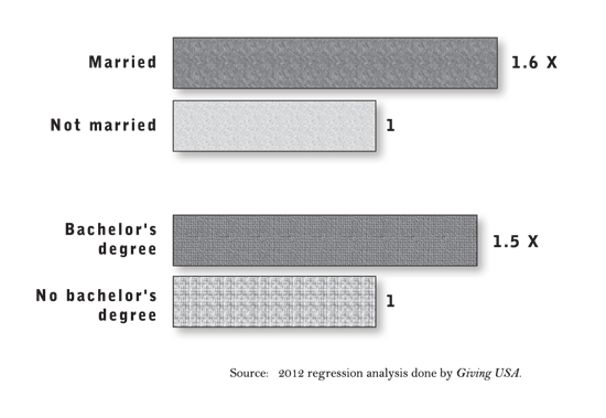
Just as with volunteering (Graph 9), certain factors have a strong influence on willingness to make donations. Religion (see next graph), marriage, and education are foremost among the factors that incline people to generosity. For this graph, all other variables like income, age, race, geography, and so forth were held constant. After those adjustments, it could be seen that married people give to charity at 1.6 times the rate of counterparts who are identical in every other way except that they are unmarried. Likewise, people who have completed college are 1.5 times as likely to give compared to an otherwise equivalent person without that education.
Religion and Charitable Giving
Religious faith is a central influence on giving. Religious people are much more likely than the non-religious to donate to charitable causes—including secular causes—and they give much more.
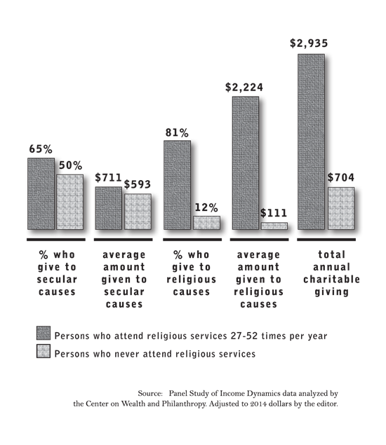
This chart holds all other demographic variables like income, race, education, etc. constant, so that when religious and non-religious counterparts are compared they are true peers in every other way. And the results show that persons who attend religious services twice a month or more give over four times as much as persons who never attend services.
We know the religious are also far more likely to volunteer. Among Americans who have volunteered within the last year, three quarters belong to a religious organization, one quarter do not.
Heavy vs. Light Charitable Giving by Party Registration
Among Democrats, Independents, and Republicans alike, almost exactly half of the group averaged $100-$999 in annual charitable donations at the time of this 2005 poll. There was virtually no difference among the parties in the size of that moderate-giving group, so those results were not included in the graph to the left.
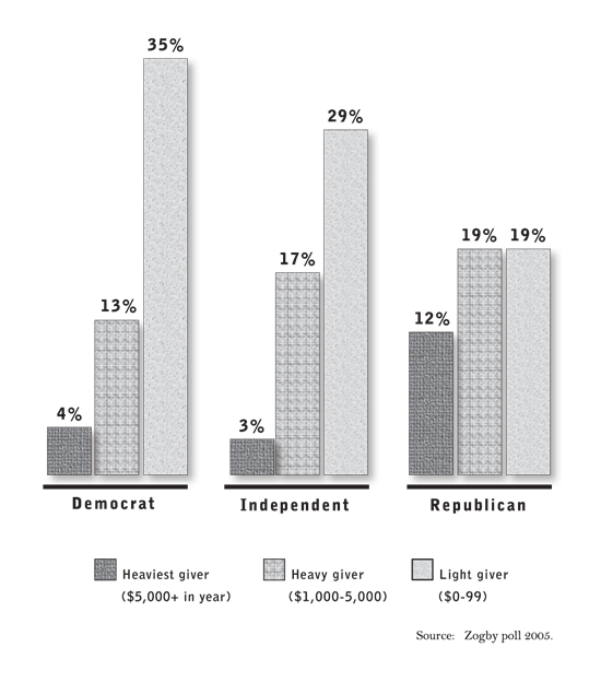
If, however, you zero in on giving that is heavier or lighter than the middle range (the bars pictured here), you find that the parties differ a lot. Democrats and Independents both had many zero-to-very-light givers (less than $100 for the year), and modest numbers of heavier givers. Republicans, in comparison, had comparatively few skinflints, and numerous serious donors—31 percent sharing at least $1,000 with charity, versus 17 percent among Democrats, and 20 percent among Independents.
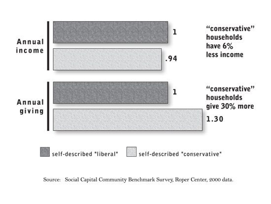
Income and Giving by Ideology
As individual donors, conservatives are hearty givers—as made clear in this graph, the one previous, and many other data sets.
When it comes to running foundations, though, liberals tend to control the reins. Matched analyses of the major American foundations reported in the book The New Leviathan found 82 foundations whose staff took a clear conservative orientation in their giving, and 122 foundations whose staff operated with a clear liberal orientation. The conservative-controlled foundations had assets of $10 billion in 2010, from which they gave away $832 million annually. That same year, the liberal-controlled foundations had assets of $105 billion (more than ten times their conservative counterparts), and gave away $8.8 billion annually (11 times as much as conservative counterparts).
Many foundations end up espousing the priorities and orientations of their staff rather than the principles of the donor behind the foundation. As this has become more widely understood, some new foundations have made efforts to protect “donor intent” and be sure that funds are expended on causes compatible with the founder’s views. There has also been a sharp jump of interest in “sunset” foundations—which spend all their money relatively close to the donor’s lifetime, rather than existing in perpetuity, where capture by staff becomes almost inevitable. See the text accompanying Graph 18 for more details on sunsetting.
Generosity of States
For the analysis graphed here, the Chronicle of Philanthropy analyzed official IRS data on income and giving, right down to the county level. The results showed that rural states, and specifically the Bible Belt and Mormon West, give more of themselves for charity. Other ways of measuring, carried out by different groups using alternate statistical sources, have shown essentially the same pattern. Though it comes as a surprise to some observers, it is not Americans in the high-income, urban, liberal states like Massachusetts or California who are our most generous citizens. Rather it is residents of middle-American, conservative, moderate-income, religiously active regions who step up the most.
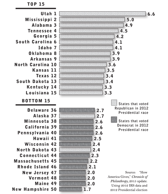
Several observers have pointed out the political twist to this reality. When it reported its findings, the Chronicle of Philanthropy noted that the states that rank highest in charitable giving all voted Republican in the 2012 Presidential election, while all but a couple of the least generous states voted for the Democrat (that’s what the color coding to the left reflects). Economist Arthur Brooks, author of the detailed charity analysis Who Really Cares, likewise states that “the electoral map and the charity map are remarkably similar.” He notes “there is a persistent sterotype about charitable giving in politically progressive regions of America: while people on the political right may be hardworking and family-oriented, they tend not to be very charitable toward the less fortunate,” while, “those on the political left care about vulnerable members of society, and are thus the charitable ones…. This stereotype is wrong.”
Brooks points out that these differences go beyond just what households donate in money. He cites studies showing that conservatives are more likely to do things like donate blood, and to volunteer. Much of this difference he credits to the comparative religiosity of conservatives. The fact that liberals call for government to help others while conservatives feel called to help directly also seems to factor into differences in behavior.
Generosity of Cities
A pattern similar to what the previous graph showed for states is also clearly visible in this data on giving levels in America’s 50 biggest cities. It is residents of our Mormon and southern Bible Belt metro areas who are our most generous citizens. Meanwhile, many of our very wealthiest urban areas—like San Francisco and Boston—rank low on generosity.

Note here the interesting divergence between Dallas and Austin. Those two cities, just 180 miles apart, share the same economic climate, exact same levels of state taxation, same basic cost of living. Where they differ rather sharply is in culture. The fact that Dallasites give almost 40 percent more to charity than Austinites underlines the powerful influence on charitable behavior exerted by factors like religious practice and political ideology.
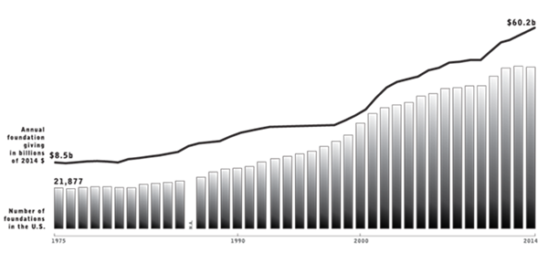
Foundation Numbers and Giving
The number of private foundations, and the heft of their endowments and annual giving, have soared over the last generation.
Americans are generally happy with the growing activity of foundations in solving problems—a 2009 poll asked community leaders who have had professional contact with the charitable sector whether they thought foundations have too much, too little, or the right amount of influence on issues in their community; 51 percent answered “too little,” 42 percent said “the right amount,” and just 7 percent said “too much.” Our own survey research in 2015 found the public inclined to give foundations and the rest of the philanthropic sector wide latitude to operate free of government regulation or interference; see Question 9 in our section “Results of an Original 2015 National Poll.”
At the same time, Americans don’t place foundations at the heart of our philanthropic efforts. They view small gifts from millions of everyday donors as far more important than the big initiatives of foundations (Question 15 in our national poll). And as a factual matter they are entirely right, as Graph 3 in this section shows.
There is, however, a considerable knowledge gap when it comes to the details of how foundations operate. Only about one American out of ten, and half of community leaders, can name an extant foundation when asked by pollsters.
One interesting trend in the growth of foundations is for donors to set them up so that they spend themselves out of existence within a generation, rather than letting them exist in perpetuity. In 2010, a quarter of the assets in America’s 50 largest foundations were in trusts that will sunset—compared to only 5 percent 50 years ago. Spending down allows a foundation to have a larger, quicker effect than trickling out funds indefinitely. And it reduces the likelihood of the organization drifting into purposes not approved by the donor (a problem discussed at Graph 15).
Foundation Types
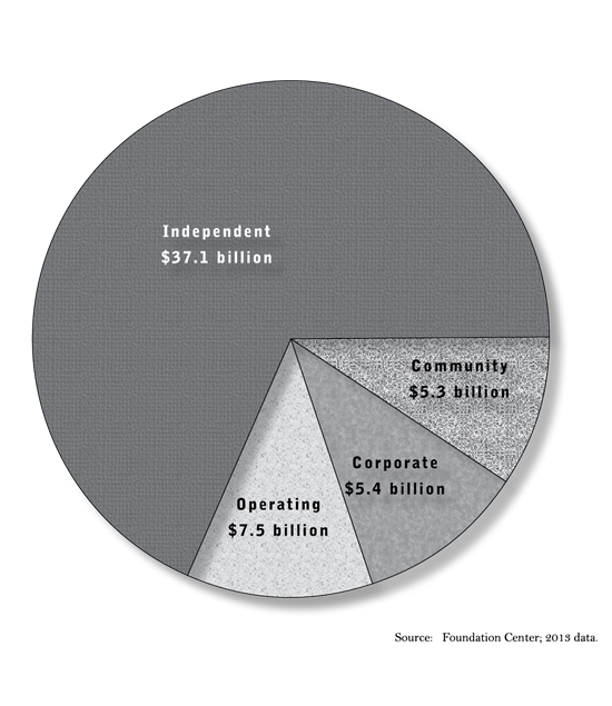
Traditional independent foundations are by far the largest institutional givers. Community foundations pool donations from many donors within a region; there are more than 780 sprinkled across the country. Corporate foundations are a long-time presence in U.S. philanthropy. Operating foundations are a special subset that spend most of their money running their own programs, rather than disbursing funds to other charitable operators. Leading examples of some of these foundations are presented in the three graphs following.
Top 50 Independent Foundations

Top 50 Community Foundations

Top 50 Corporate Foundations

Donor-Advised Fund Growth

Today’s very fastest-growing instrument for giving money to charitable causes is the donor-advised fund. DAFs provide givers a much simpler alternative to setting up a private foundation. Donor-advised funds now outnumber private foundations by more than two to one, and in 2015 they funneled close to $15 billion to charities favored by their contributors. DAFs are both efficient and effective: the average fund now pays out in annual charitable grants a full 21 percent of the assets contained in the fund. That’s three or four times the rate at which typical foundations pay out.
Top Ten Donor-Advised Funds

There are many sponsors of donor-advised funds. Most community foundations around the country offer them. So do various affinity groups like the National Christian Foundation and the many local Jewish giving federations. Today’s fastest-growing sponsors of DAFs are commercial investment companies. They have made it exceptionally convenient for Americans to put away money for charity, keep it growing healthily while specific recipients are being planned, and then dispatch the donations efficiently with a few clicks of a mouse. The hundreds of thousands of individuals who have established accounts at Fidelity Charitable had granted $21 billion to charities as of 2015, with the total rising fast.
Private Donations for Overseas Aid
Americans are much more willing than other peoples to voluntarily donate money to help the poor and stricken in foreign lands. The figures here depict private charitable giving in various forms.

Of course there are other ways that a nation can give to less developed countries in addition to private philanthropy—official government aid, remittances to families back home by immigrants, private business investment, etc. See Graph 26 and its text for more on this subject. When you add up all of these sources of aid, the U.S. comes out far ahead of any other nation, sending $365 billion overseas annually to developing countries.
U.S. Overseas Assistance
Few people realize that private giving is now a much bigger part of how Americans aid the poor in foreign lands than official government aid. The $44 billion of annual aid depicted here comes from a variety of sources: private charities, religious groups, corporate giving, foundations, volunteers, etc.
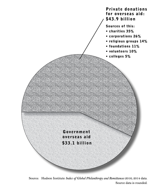
Another very large source of economic assistance to the overseas poor, which we have chosen not to depict here but which has been painstakingly estimated in the Hudson Institute report from which this data is taken, is remittances sent back home by U.S. immigrants from poor lands. These amount to over a hundred billion dollars every year, and are more important to family welfare, health, and education in many underdeveloped countries than either private or governmental charity.
Anyone trying to understand the financial flows that aid the poor overseas must also consider one final element: private investment in developing countries. More than $179 billion of U.S. capital was committed to projects in poor nations in 2014, with for-profit aspirations. This job- and growth-creating money is probably the most important form of all of international sharing.
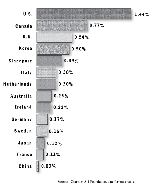
Giving Levels, by Country
A number of studies have been undertaken to compare the charitable giving of various countries in fair ways—adjusting for differences in standards of living, population, and so forth. All end up showing about the same relationship that is charted here: Americans are about twice as generous in their private giving as our kissing cousins the Canadians, and 3-15 times as charitable as the residents of other developed nations. Americans also volunteer more than almost any other wealthy people.